Redesign the LENA Report: Making Child Development Data more Accessible

Redesign the LENA Report: Making Child Development Data more Accessible

LENA uses a wearable recording device to measure a child’s daily language environment. The report presents metrics that help caregivers better understand their child’s language exposure.

LENA uses a wearable recording device to measure a child’s daily language environment. The report presents metrics that help caregivers better understand their child’s language exposure.

My Role

UX Designer & Researcher

Team

Whole Communities–Whole Health,

UT Austin

Timeline

Sep 2025 - Present

Toolbox

Figma

MAXQDA

Zoom

My Role

UX Designer & Researcher

Team

Whole Communities–Whole Health, UT Austin

Timeline

Sep 2025 - Present

Toolbox

Figma

MAXQDA

Zoom

My Role

UX Designer & Researcher

Team

Whole Communities–Whole Health, UT Austin

Timeline

Sep 2025 - Present

Toolbox

Figma

MAXQDA

Zoom

Context

Context

Background

Background

Whole Communities–Whole Health (WCWH) is a research institute at UT Austin that studies how biological, environmental, and social factors influence the well-being of children and families in Eastern Travis County.

What is LENA

LENA is a technology system that uses a small wearable device and software to measure children’s language environments and interactions. The system processes the collected data into measures such as child vocalizations and conversational turns.


Within the WCWH study, these findings are shared with participating caregivers through individualized reports to help them understand their child’s language experiences.

What Problem were We Solving

Challenge

Challenge

The original LENA reports contained technical language, dense explanations, and complex data visualizations.


For caregivers with different literacy levels and data familiarity, important findings could feel overwhelming rather than useful. Users needed help understanding what each metric represented, how to interpret developmental percentiles, and which information mattered most.

Problem Statement

"How might we make child development data more accessible, understandable, and actionable for caregivers?"

Research

Research

Understand the Context

Understand the Context

I began by auditing the original report and working with the research team to understand its content, constraints, and communication challenges.


The initial review revealed that:

  • key findings competed with supporting details

  • technical terms lacked clear explanations

  • visuals required considerable interpretation

  • the report was not optimized for mobile viewing

Key Insights

Key Insights

01

Users needed more than just data

Caregivers wanted to understand what the results meant for their child, not simply see numbers and charts.

02

Visuals shaped first impressions

Users often looked at graphs and color cues before reading explanations. Visual clarity strongly influenced their understanding.

03

Clear guidance fostered confidence

Explanations and practical recommendations helped participants feel more confident interpreting the report and taking next steps.

01

Users needed more than just data

Caregivers wanted to understand what the results meant for their child, not simply see numbers and charts.

02

Visuals shaped first impressions

Users often looked at graphs and color cues before reading explanations. Visual clarity strongly influenced their understanding.

03

Clear guidance fostered confidence

Explanations and practical recommendations helped participants feel more confident interpreting the report and taking next steps.

01

Users needed more than just data

Caregivers wanted to understand what the results meant for their child, not simply see numbers and charts.

02

Visuals shaped first impressions

Users often looked at graphs and color cues before reading explanations. Visual clarity strongly influenced their understanding.

03

Clear guidance fostered confidence

Explanations and practical recommendations helped participants feel more confident interpreting the report and taking next steps.

Deliverables

Design

Highlights

Design Highlights

Before

The original report contained valuable information, but its document-style layout and limited user-centered design guidance made key findings harder to understand and act on.


  • Dense layout made key findings difficult to scan

  • Mobile viewing and often required zooming

  • Technical terms lacked clear context

  • Limited guidance on what caregivers could do next

Before

The original report contained valuable information, but its document-style layout and limited user-centered design guidance made key findings harder to understand and act on.


  • Dense layout made key findings difficult to scan

  • Mobile viewing and often required zooming

  • Technical terms lacked clear context

  • Limited guidance on what caregivers could do next

After

01

Mobile-First Readability & Easier Navigation

Mobile-First Readability

& Easier Navigation

  • Redesigned the report for small screens with a clearer reading flow and section structure.

  • Added a clickable table of contents so caregivers can quickly jump to relevant sections.

02

Clearer Data Interpretation

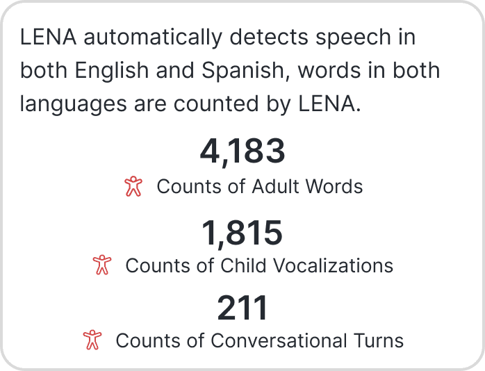
  • Surfaced key metrics in a scannable overview before users explore detailed results.

  • Added plain-language explanations, percentile guidance, and research context to help caregivers understand what the results mean.

03

Supportive Visual Communication

  • Simplified charts and introduced icons, labels, and color cues to make important information easier to scan.

  • Paired visuals with short explanations so caregivers can connect each metric with its meaning.

  • Simplified charts and introduced icons, labels, and color cues to make important information easier to scan.

  • Paired visuals with short explanations so caregivers can connect each metric with its meaning.

04

Actionable Next Steps

  • Presented talking tips in a more approachable format to encourage everyday language interactions.

  • Curated community resources with practical details such as audience, cost, format, and contact information.
05

Designing for Trust & Reassurance

Designing for Trust & Reassurance

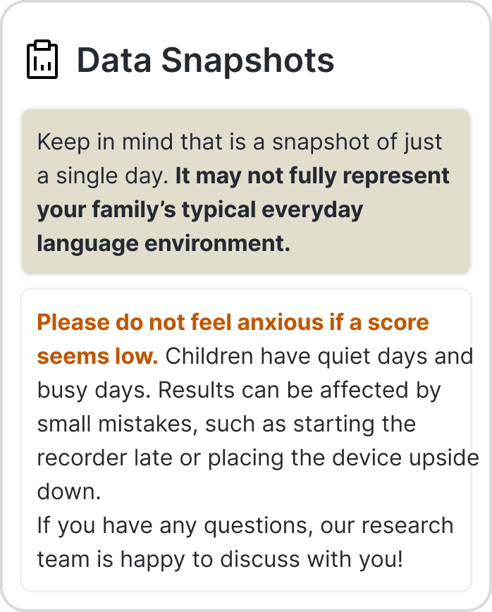
Because child-development results can feel personal or concerning, I also designed emotional supportive content to help caregivers relieve unnecessary anxiety.

  • Added contextual language explaining why a single recording may not fully represent a child’s typical day.

  • Clarified data privacy and gave caregivers a direct way to contact the research team with questions.

Validation & Impact

User Testing

I developed moderator scripts and scenario-based tasks to evaluate how caregivers navigated and interpreted the redesigned report.

During each session, participants were asked to think aloud as they explored the report, interpreted graphs and percentiles, explained results in their own words, and described moments of confusion or confidence

What We Heard

1 VISUALS IMPROVED CLARITY

"The graphs are very useful… it's easier to understand the data."

Participants generally found graphs, labels, and visual cues easier to follow.

2 CONTEXT WAS STILL NEEDED

“26th percentile kind of scared me at first…”

Some participants could read the data but were unsure how to interpret what the numbers meant.

3 CONTEXT INCREASED CONFIDENCE

“I think it does boost my confidence, where I know that you all are working with a good sample size.”

Participants felt confident when they knew how the data was collected and compared.

4 ACTIONABLE GUIDANCE HELPED

“That enables me to take action, or do something extra, to help them improve.”

Participants valued talking tips, resources, and practical recommendations.

What We Heard

1 VISUALS IMPROVED CLARITY

"The graphs are very useful… it's easier to understand the data."

Participants generally found graphs, labels, and visual cues easier to follow.

2 CONTEXT WAS STILL NEEDED

“26th percentile kind of scared me at first…”

Some participants could read the data but were unsure how to interpret what the numbers meant.

3 CONTEXT INCREASED CONFIDENCE

“I think it does boost my confidence, where I know that you all are working with a good sample size.”

Participants felt confident when they knew how the data was collected and compared.

3 CONTEXT INCREASED CONFIDENCE

“I think it does boost my confidence, where I know that you all are working with a good sample size.”

Participants felt confident when they knew how the data was collected and compared.

4 ACTIONABLE GUIDANCE HELPED

4 ACTIONABLE GUIDANCE HELPED

“That enables me to take action, or do something extra, to help them improve.”

Participants valued talking tips, resources, and practical recommendations.

Reflection

Reflection

Takeaways

Takeaways

This project taught me that accessible information design is not simply about reducing text. It requires balancing research accuracy with the needs, confidence, and lived experiences of the people receiving the information.

I also learned that comprehension and confidence are closely connected. A user may understand a graph but still feel uncertain about interpreting its significance. This shifted my focus from designing only for task completion to designing for reassurance, trust, and meaningful action.

Next Steps

Next Steps

1

Keep working on qualitative coding and thematic analysis in MAXQDA.

2

Conduct the remaining round of usability testing.

3

Refine language, visualizations, and recommendations.

4

Prepare the report for implementation in the app Hornsense.

Nice to meet you!

Made with love♡

© 2026 Christine Chien

Nice to meet you!

Made with love♡

© 2026 Christine Chien

Nice to meet you!

Made with love♡

© 2026 Christine Chien